“Dow tanks 800 points in worst day of 2019” – CNBC.com 8/14/19
In my last letter to clients, I pointed out how eager news outlets are to print eye-catching headlines referencing the number of points the Dow Jones Industrial Average drops. Well, today was another example of such a phenomenon with the above headline pulled directly from CNBC.com. To anyone trying to make important investment decisions, these headlines offer nothing of value. They are meant to draw attention to whatever news outlet is proffering their “hard-hitting” business news and not meant to provide investment advice.
To put today’s decline into perspective, it helps to know that while today represented the 4th largest point drop in the history of the Dow Jones Industrial Average, it is only the 380th largest in percentage terms. As the stock market continues to climb higher, “normal” percentage declines will be expressed in larger and larger numbers.
Now, let us look at why stocks are selling off today. While stocks rallied yesterday, following positive comments about tariffs, news that the yield curve had inverted spooked stock investors today. This is significant to many investors because an inverted yield curve has preceded every recession in recent history. Many investors believe that recession = crash. While this may sound ominous, history suggests it is not. In fact, history suggests stocks are poised to go higher.
Before we delve into some of the historical evidence for higher stock prices, we want to make sure clients understand what is meant by a yield curve inversion. Bonds are issued in various maturities. Typically, short-term bonds have a lower yield than long-term bonds. For instance, a 2-year bond might yield 3% while a 5-year bond yields 4% and a 10-year bond yields 6%. If one was to plot the maturity and yield, a line going from the lower left of the graph to the upper right would appear. This is commonly referred to as a “normal” yield curve.
However, sometimes demand for the higher-yielding, long-term bonds increase disproportionately to that of the short-term bonds. This demand drives prices higher and yields lower. An “inverted” yield curve results from the long-term yield is lower than the short-term yield. A downward-sloping, or inverted, slope forms.
Typically, when economic activity begins to slow and/or inflation fears subside and/or deflation fears increase, the yield curve flattens. When it inverts it is a strong signal to the markets. This explains why stocks got spooked today.
But, as we consistently tell clients, reacting to one-day events in the market can damage performance more than enhance it. We believe today is another example of investors panicking rather than thinking. Let us take a look at some information that supports our sanguine view on stocks.
In the table below, we see that since 1978, the yield of the 2-year Treasury Bill has exceeded that of the 10-year Treasury Note (inverted yield curve) five times. The average number of months until the recession arrived was over 21 months.

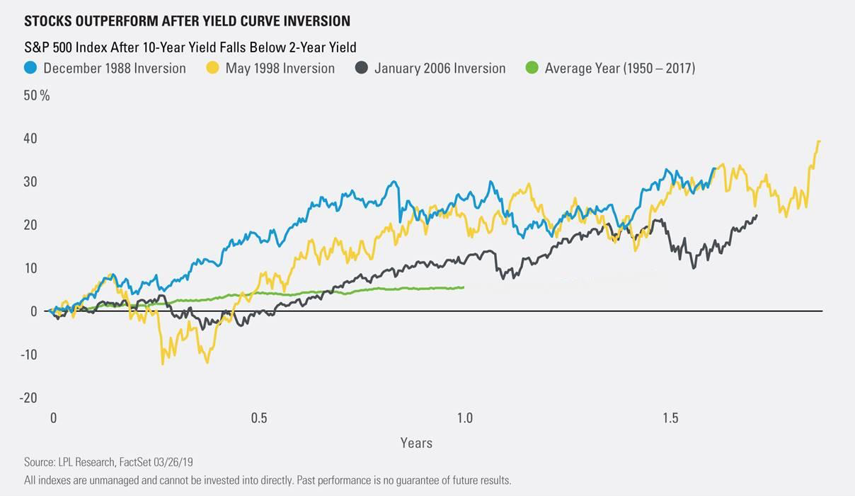
In the chart below, we see how stocks performed during the months following the inversion. As you can see, in every case, not only were stocks higher 12 months later, they were higher than the average 12-month period from 1950-2017.
So, while past results do not predict future results, we believe it is helpful to use history to help us form our opinions and reactions to events when they come along. In this case, we are remaining calm and focused on using this period of volatility as an opportunity to strengthen client portfolios.
Sincerely,
Craig Kessler, Chief Investment Officer